With the Neptune design we didn't really know what we wanted to have, so at the beginning we have explored various designs and approaches.
Below I have produced some silhouettes that later would be used as a starting point for our Neptune design. As far as the reference I have looked at various mythological paintings, pictures and character description and also at multiple movies such as Pirates of Caribbean.
As you can see we have explored quite a lot of different designs. I have painted both humanoid characters as well as insects and more generic fantasy creatures.
Once this stage was finished we have chosen no. 3. From this point on I have started producing various sketches based on the silhouette.
Based on the silhouette above I have produced various sketches for the Neptune character. I really enjoyed this process, because I had a lot of freedom and I was able to explore many different styles and concepts. During this phase I imagined Neptune as a rotting, chubby looking character with tendency to sit in one place, or even being chained to the wall. He was supposed to be big, grumpy and have a strong appearance. Although I found number 8 really appealing to me, my team decided that we want to go with number 5.
In this stage I have started to explore different heads for the Neptune. I have extensively looked at the reference that I have mentioned previously. This was fun process and I really tried to make all the faces different from each other.
And here's the final illustration. I have used quite a lot of different colors on the character, and I think it worked quite well. Although he does not look quite as angry as I'd imagine him he still looks appealing. I have intentionally left out painting lower body, due to the fact that this won't be visible in game. Neptune will be half way in the water so I saw no point in painting legs. I really enjoyed working on this piece.
Neptune definitely looks unique and although he does not resemble the mythological picture of him, I still think he will fit well with our game idea.
Monday, 30 November 2015
Thursday, 26 November 2015
Team Twist - Tavern Design
As a part of our hub location we have decided that we want to have some sort of tavern that will be used as a means to regenerate health or buy potions. As far as the design go, we knew from the beginning what we wanted to do. The ground floor was something that we really explored in depth.
At the beginning we wanted for a player to be able to enter the tavern, but as the time went on we decided that player will not be able to enter the tavern. I think this approach will save us quite a lot of time and maybe in future, when we finish all the fundamental bits then we might come back to it and expand on it. For now we wanted to use the windows on the ground floor as a way of communicating with the maid inside.
Overall I think this tavern turned out great and it will blend well with other buildings.
At the beginning we wanted for a player to be able to enter the tavern, but as the time went on we decided that player will not be able to enter the tavern. I think this approach will save us quite a lot of time and maybe in future, when we finish all the fundamental bits then we might come back to it and expand on it. For now we wanted to use the windows on the ground floor as a way of communicating with the maid inside.
Overall I think this tavern turned out great and it will blend well with other buildings.
Team Twist - Blacksmith station
I have been asked to produce a painting that would represent blacksmith station. I really enjoyed working on this project and I have produced various paintings that looked quite different from each other. That way I think I have produced enough for the team to chose from.
This painting was the first one I have done for this assignment. I really wanted to capture the old, abandoned look and I think I have done it quite successfully. While receiving feedback I have been told that this painting looked a bit too medieval and I should maybe explore more ideas.
While this painting is quite similar to the one above I have tried a different approach with the house design. This one is much more sharp on the edges and fits a lot better with the Victorian era.
This is a design that we decided to go with. I really like this painting and I think I have capture Victorian feel quite well. The pointy roof bits is something that I have been encountering quite a lot while looking through various references. Also, the whole design is a lot more clean and I think it will work well within the game.
This painting was the first one I have done for this assignment. I really wanted to capture the old, abandoned look and I think I have done it quite successfully. While receiving feedback I have been told that this painting looked a bit too medieval and I should maybe explore more ideas.
While this painting is quite similar to the one above I have tried a different approach with the house design. This one is much more sharp on the edges and fits a lot better with the Victorian era.
This is a design that we decided to go with. I really like this painting and I think I have capture Victorian feel quite well. The pointy roof bits is something that I have been encountering quite a lot while looking through various references. Also, the whole design is a lot more clean and I think it will work well within the game.
Wednesday, 14 October 2015
Team Twist - The Hub
Together with a team we have decided to create some kind of a hub, in which player will be able to rest, restore his health and buy new items. We needed a city layout so I've decided to paint a simple isometric village view.
We decided that we will have two main buildings. One is a tavern, in which, as said before, player will be able to regenerate his health. The other building is a Blacksmith station, where player will be able to sell items and fix equipment.
I've also included three exits that will lead to the locations in which player will level up and fight.
We decided that we will have two main buildings. One is a tavern, in which, as said before, player will be able to regenerate his health. The other building is a Blacksmith station, where player will be able to sell items and fix equipment.
I've also included three exits that will lead to the locations in which player will level up and fight.
Team Twist - Creature Design
Recently I was asked to produce two creatures that could be used in our first level. We decided to go with the sewers, so we needed some dudes that would fit the setting. We've decided that we want to use Greek mythology creatures, but completely redesign them into our own.
Here I've produced two creatures with couple of variations.
There isn't much to talk about this creature other than we wanted it to be quite big.
In Greek mythology Charybdis is described as a whirlpool that sucks up all the ships that come by. At first I drew a big mouth sticking out of water, but then me and my team decided to redesign the creature, so I drew two different variations and then a couple more on the chosen design. We also decided that player will not see any of the body, simply because it will save us both time and processing power.
Here I've produced two creatures with couple of variations.
There isn't much to talk about this creature other than we wanted it to be quite big.
In Greek mythology Charybdis is described as a whirlpool that sucks up all the ships that come by. At first I drew a big mouth sticking out of water, but then me and my team decided to redesign the creature, so I drew two different variations and then a couple more on the chosen design. We also decided that player will not see any of the body, simply because it will save us both time and processing power.
Year 3 - The Begining!
I took a role of a Lead Concept Artist, in which I do the majority of artworks.
Here I'm sharing with you first painting that I've produced for this project. The purpose of this was to explore both the architecture as well as the mood. I wanted to portray a dark and gritty London streets that could influence my team, and maybe push us further in the future.
Wednesday, 15 April 2015
World Building - Low poly weapon Final render.
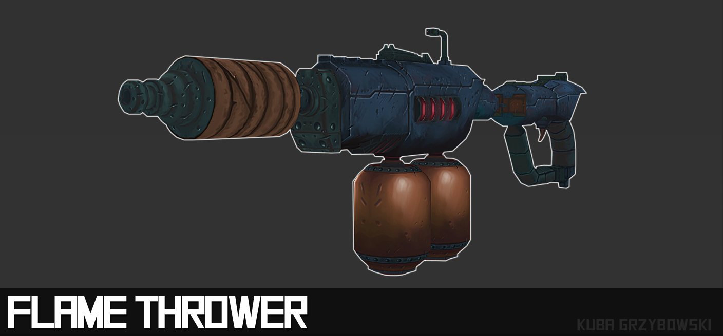
After countless hours of texturing and modeling I have finally finished my flame thrower. I am really happy with the outcome. I achieved everything I wanted, although I wish I had more time to tweak my design. I must admit that I really enjoyed working on this project, even though it wasn't my comfort zone. I really wanted to try myself in 3D environment. The topology of the model works well and has a nice flow to it. I am also pleased with the silhouette of the weapon. Even without the textures weapon is readable.
In this shot you can see more clearly how I produced artificial light using highlights on the material as well as the cuts and other details.
Above is the picture of the mesh of the flame thrower. The whole model is low in polygons and could definitely be used in older as well as in newer games. The whole purpose of going this low with polygons is that I can produce majority of details using hand painted textures. The exact same technique is used by people over at Blizzard or Carbine Studios.
Here's the finished weapon. I've used 3D-Coat for the texturing work and photoshop for the presentation purpose. As you can see I've added quite a lot of details that would otherwise require a high number of polygons. Cuts in the cloth and metal were hand painted which saved quite a lot of memory.In this shot you can see more clearly how I produced artificial light using highlights on the material as well as the cuts and other details.
Here I have painted quite a lot of lights on the back of the model. I think it definitely made the weapon more alive and believable. As far as the glow goes I have used exactly the same technique as in previous shot. I've added a slight wash over the blue area with a soft brush set to soft light, which gave an illusion of glow.
Overall I am quite happy with the outcome. I only wish I had more time to add some particles around the gun barrel or cables in the middle area, but even though I did not make these I still think my weapon looks appealing and I feel that I did really well with the task.
Subscribe to:
Posts (Atom)